Have you ever been in a presentation where the speaker fumbled through their slides jumping back and forth? …………

Have you ever been in a presentation where the speaker fumbled through their slides jumping back and forth? …………
Did you know that most burned DVDs and CDs don’t last long? Have you ever placed a 5-year-old DVD in the drive only to find out it was no longer readable? This would be tragic if the DVD was your wedding video, pictures of a vacation or other keep sake. There were DVDs that you could obtain that would last longer, but they were expensive and hard to find. Now there is a new technology that is changing all of this. The Millenniata M-Disc is a 4.7GB DVD with a data layer made out of stone-like metals and metalloids. Burned CDs and DVDs have a very soft recording/data layer that isn’t very resistant to heat, humidity and light. However, the M-Disc on the other hand has a much tougher data layer that last for 1000 years. Unfortunately, M-Discs can’t be burned with your current DVD burner. It takes a laser that’s five times stronger than normal to melt stone. On the other hand, M-Discs are backwards compatible and can be read by normal DVD drives. When you replace your CD/DVD burner make sure it is M-Disc compatible.
By: Rajat Shetty
Most offices are well equipped with high definition scanners, printers, copiers, etc. However, there are instances when people need to scan documents on the go, and a scanner is not readily available. The Cam-Scanner app makes scanning in almost any location possible.
While this application is not suitable for high definition scans, you can surely use it for urgent and basic scans of a two or three page document. I scanned my homework with this application, and it worked just fine!
The free version for Cam-Scanner is available in the Apple-App store and the Google Play store (For Android devices). This easy to use app scans documents with your cellphone camera.
To scan a document, follow these steps:
Here is a screenshot of scanned document from my Android phone:
The drawbacks associated with this particular application are that you need the latest cell phone which has a high resolution camera (Probably 8 mega pixel onward). Also it’s not suitable, if you are looking to scan large set of documents or books. For a fully functional Cam-Scanner, you can buy the full version called “Cam Scanner Pro”. This is available on App-stores for both Apple and Android phones. However, the free version works fine for small sets of documents. The best part is you can scan, edit, and email the scanned document from your phone, within a matter of minutes.
By: Rajat Shetty
Excel Pivot tables help summarize your data. They also allow you to avoid using complex formulas like Vlookup, SumIF, etc. to create a table. It can take a little while for a newbie to get the hang of Pivot tables. However, the 2013 Excel updates make creating Pivot tables even simpler.
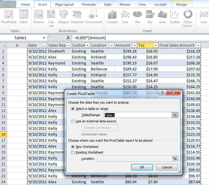
A few years back, we had to follow these steps to create a simple pivot table:

4. Manually drag and drop the required fields according to our requirements to calculate-Sum, average, percentage, etc.
With the new Microsoft Excel-2013, you are just one click away from creating a basic pivot table. The best part is you do not have to drag and drop anything into the field list. As seen to the right, you can pull the exact information you need from a complex spreadsheet without having to go through the above mentioned steps for Excel-2010.
Instead of inserting a Pivot table from the Insert tab, just click on the “Recommended Pivot Tables” option on the Insert tab.
 As you can see in the above image, Excel automatically suggests three or four options for your data range. All you have to do is make sure that your cursor is in one of the data entries on the main sheet before you click on “Recommended Pivot Tables”.
When you select one of the recommended Pivot tables, it automatically adjusts the fields without the user having to drag and drop in the Pivot table field list. Once the Pivot table is created you can customize the fields according to your requirements.
In summary, we use the following steps to create a Pivot table using Excel-2013:
1. Organize and arrange data in columns
2. Make sure each column has a heading
3. Click on Insert and select the “Recommended Pivot Charts” option
4. Choose the desired Pivot table
5. Sit back and relax
Here’s looking forward to future updates from Microsoft Office. Maybe next time Excel will be even more intuitive.
by Adam Jones
In the Classroom Support office we get a lot of phone calls from professors who are having trouble setting the volume in their rooms. Since this comes up so often, I’ve decided to write a guide to help you.
While this might seem simple to experienced computer users, it is still confusing to others. (Which is exactly how I feel when my father tries to explain what an intake manifold does. No idea.) For those of you who have trouble with sound settings, just follow these instructions, and you’ll know what to do. Continue reading Where’s My Volume?