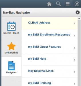
 Last summer we started a journey towards a more intuitive my.SMU by releasing mobile-friendly navigation and a completely updated financial interface. This summer, we have been working on the next critical step in this journey by creating the framework for easier navigation through the entire system. You may not notice an immediate difference, but the new framework addresses the amount of time needed to release improved features.
The Navigator

After the my.SMU upgrade in September, some of you may notice that the navigation on the left side is no longer present. Instead, most of what you need is on the right side navigator. Clicking the NavBar button on any page in my.SMU will open the navigation sidebar on the right-hand side of the page. This sidebar contains your Favorite links, recent places you’ve visited, and the Navigator. The navigator is very similar to the navigational links you used in older versions of my.SMU.
Further, we are working with each line of business to create Navigation Collections of their most used pages. A Navigation Collection provides quick access to a group of pages, and displays on the left side. These new left side Navigation Collections, in conjunction with your favorites, allow for simple and efficient navigation to the pages you visit most often.
Additional documentation on favorites can be found here.
If you have any questions regarding these changes to my.SMU navigation, let the IT Help Desk know.


