 All of us have messages that we want to share with others, and let’s face it. Most of us don’t want to stare at pages of plain text all day.
How do we go from busy, text filled pages to something that your average Joe might want to read? Great question!
First, I remember back to mom’s art lessons. (It’s amazing what you can learn as the child of an artist!) She asked, “When you look at the page, what do you see first?” The goal is to grab the reader’s eyes at the beginning and pull them through your page. Often that means top left zig-zagging to the bottom right, but that’s not always the case. To the right the orange numbered arrows direct the reader through the document in a creative way.
You’ve got your reader’s attention. Now, how do you keep it? One method is using visuals or info-graphics… without sacrificing readability.
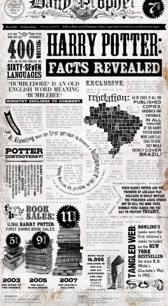
Info-graphics are intuitive, memorable, and often leave your page with desirable white space (the artsy term for the part of your page not covered with stuff). The example above is easy to read and engaging. To the left, you’ll see a graphic on Harry Potter book sales. While it’s visually super cool, you probably aren’t going to take the time to read all the way through that busy page (unless you’re a huge fan).
Appropriate formats vary by setting and audience. While not all of us are info-graphic design rock stars, would your readers rather read the plain text below or the vibrant info-graphic? Which stirs more creativity in the would-be social writer? And, what creative ways can you make your content pop?
The Main Steps for a Successful Ebook info-graphic was from http://blog.widbook.com/infographic-steps-for-a-successful-ebook/.
5 Steps to Make Your Social Content Great was from http://www.graphs.net/201210/5-steps-to-create-great-social-content.html/5-steps-to-create-great-social-content.


