Growing up with a blind grandfather, the importance of equity for individuals with visual disabilities was constantly reinforced. During my recent interview with Dr. Jennifer Culver, Director of Academic Technology Services for Simmons School of Education and Human Development, reminded me of that significance as she shared her experience of presenting at the Peralta Equity Conference.
Hosted by the Peralta Online Equity Initiative, the 3-day conference encompassed increasing learning equity for all learners. The first day focused on learning and allowed participants to explore best practices for addressing students’ access to technology and support. The goal was to help students grow by implementing universal design principles enabling them to access their coursework equitably.
Participants walked through analysis and reflection exercises on the second day, allowing them to generate ideas on making courses more suitable and available to students. Finally, participants focused on the mechanics and build of a course.
Dr. Culver’s session, titled Name that Image, focused on image accessibility. “I felt it was important for instructors to understand the need that all students should be able to understand the content that an image is conveying.”
Why Image Accessibility is Important
In an interactive session using Nearpod , Dr. Culver had her students evaluate visual images and explain the pros and cons of selecting specific images for course content. Here are seven concepts she outlined:
-
-
- Informative Images:

Did you know that if a basic image conveys information, you must include an alt text tag on the image? Otherwise, a student cannot benefit from your example, even with a screen reader. - Decorative Images:

Use a decorative tag for images with no functional purpose, like an emoticon or an image used as a border in the page design.
- On the web, a null (empty) alt text should be provided (alt=””) or role=”presentation” so that they can be ignored by assistive technologies, such as screen readers. Unfortunately, role=”presentation” is currently not as widely supported as using a null alt attribute.
- In PowerPoint, right-click on the image, select “view alt text,” and check the “Mark as decorative” checkbox.
- Functional Images:

Images like “Next” buttons must be labeled as such for visually impaired students. If the word is part of the button image and not actually text on an image, the student would need to know that this button is designed for them to navigate elsewhere. - Images of Text:

Including screenshots of text, like decorative quotes, instead of using the actual text, makes it impossible for learners to understand the image’s meaning. - Complex Images:

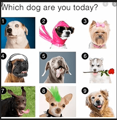
This photograph includes an image of text and an example of a complex image. The above collage of dogs is an example someone might use as an icebreaker for a class. However, if a visually impaired student participated, the alt text would need to describe all nine dogs so that the student could fully understand the message. In this case, the instructor should look for an exercise less dependent on a photo.
- Groups of images:
 These groups are often used when an individual wants to use multiple images to make one image. This adds unnecessary complexity.
 - Image Maps:
 If an image map is used, every area needs to be labeled and selectable for visually impaired students to participate.
- Informative Images:
-
A Need for Specificity
Dr. Culver concluded by demonstrating how students infer meaning from alt text. She provided alt text, asked learners to draw what they heard, and showed the differences between their drawings and the actual image.
She also provided other reminders to ensure that when using graphs and tables in courseware, you are using actual text and not screenshots or looking for alternative ways to utilize information if it is too hard to replicate using text.
“Instructors should ask themselves, ‘Does the image contribute to the content or is it aesthetic?‘ advised Dr. Culver.” If it contributes to the content, you must make some determinations to add appropriate descriptions. If it’s simply decorative, mark it so students can focus specifically on the content itself.
Questions on Accessibility?
As you build out the content for back-to-school, please keep your Academic Technology Service Directors in mind. They will be happy to assist you with questions on accessibility.


