
 Who would have thought that a simple question over a highly competitive game of Sand Volleyball at the Dedman Rec Center would result in a fascinating visualization project for the Data and Application Services team? “Would you have any research that we could assist with data visualization?” Eric Macy, IT Assistant Director of Enterprise Data Services, asked Dr. Adam Norris. The two of them spoke, and Dr. Norris, Assistant Professor of Biological Sciences, was intrigued and agreed to a meeting.
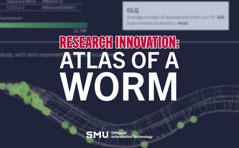
While Dr. Norris had some familiarity with data visualization, the team was able to clarify how they could work with complex data using Tableau. During that meeting, they officially kicked off the “Atlas of a Worm” project, and David Liska, Visualization Architect, would lead its efforts.
We recently had the opportunity to sit down with David and learn a little more about his work behind the scenes.
What is the purpose behind the Atlas of a Worm?
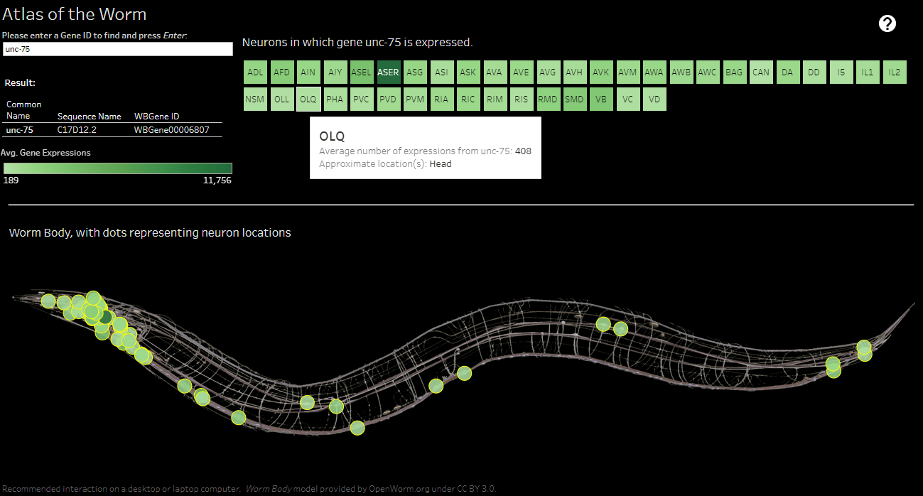
Our project aimed to show the relationship between the frequencies of gene expressions within neurons in worms. To do that, we wanted to create a resource where an end user could use one of three searchable fields to retrieve their desired information.
A worm is small; how complicated could this be? Is there that much data involved?
To some, this might seem simple. A worm is small and has no eyes and limbs, so it could be easy to presume this would be a straightforward project. However, the data set is quite complex. While some genes in a worm are only expressed once, others could be expressed over 11,000 times, and we had to take that into account.
Can you tell me how this project was developed?
After our initial meeting, Dr. Norris sent me a CSV file with over 31,000 rows of data, a column for gene identifiers, and 41 columns for neurons, along with several images of a worm. I had to develop a way that would be compatible with displaying up to 31,000 genes expressed within 41 neurons.
For this project to be successful, we had to ensure we kept our goal in the forefront before we worried about the design. It was great that we had some commonality in our understanding and could spot potential challenges ahead of time.
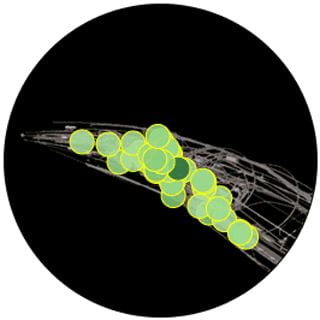
You can see below that it took a few cuts to get our design right, but ultimately, we achieved what we wanted.

Atlas of a Worm Project Impact
The visualization that was developed has received positive feedback. Dr. Adam Norris shared, “Human brains cannot make sense from a data table of 30,000 genes across dozens of cell types. But the power of data visualization is that this enormous dataset is suddenly rendered interpretable by human brains.
The ability to condense vast amounts of data into a simple interactive visualization will allow our research team to make connections and provide insights that would otherwise be impossible. We are already doing follow-up experiments based on observations made using this data visualization. This visualization will also be helpful as a way for other researchers in the field to interface with our large datasets in a user-friendly way.”
The Atlas of a Worm project kicked off in September and was accomplished with a few meetings over five weeks. The project is available to the public for preview.
If you are a researcher interested in exploring data visualization to compliment your work, please get in touch with your Academic Technology Service Director, as we would love to partner with you.