Assistant Director, Hamon Arts Library, and Curator of the Hawn Gallery, Beverly Mitchell, talked with Tino Ward, artist, about his exhibition, Phosphenes, in the gallery. The exhibition continues to May 12.
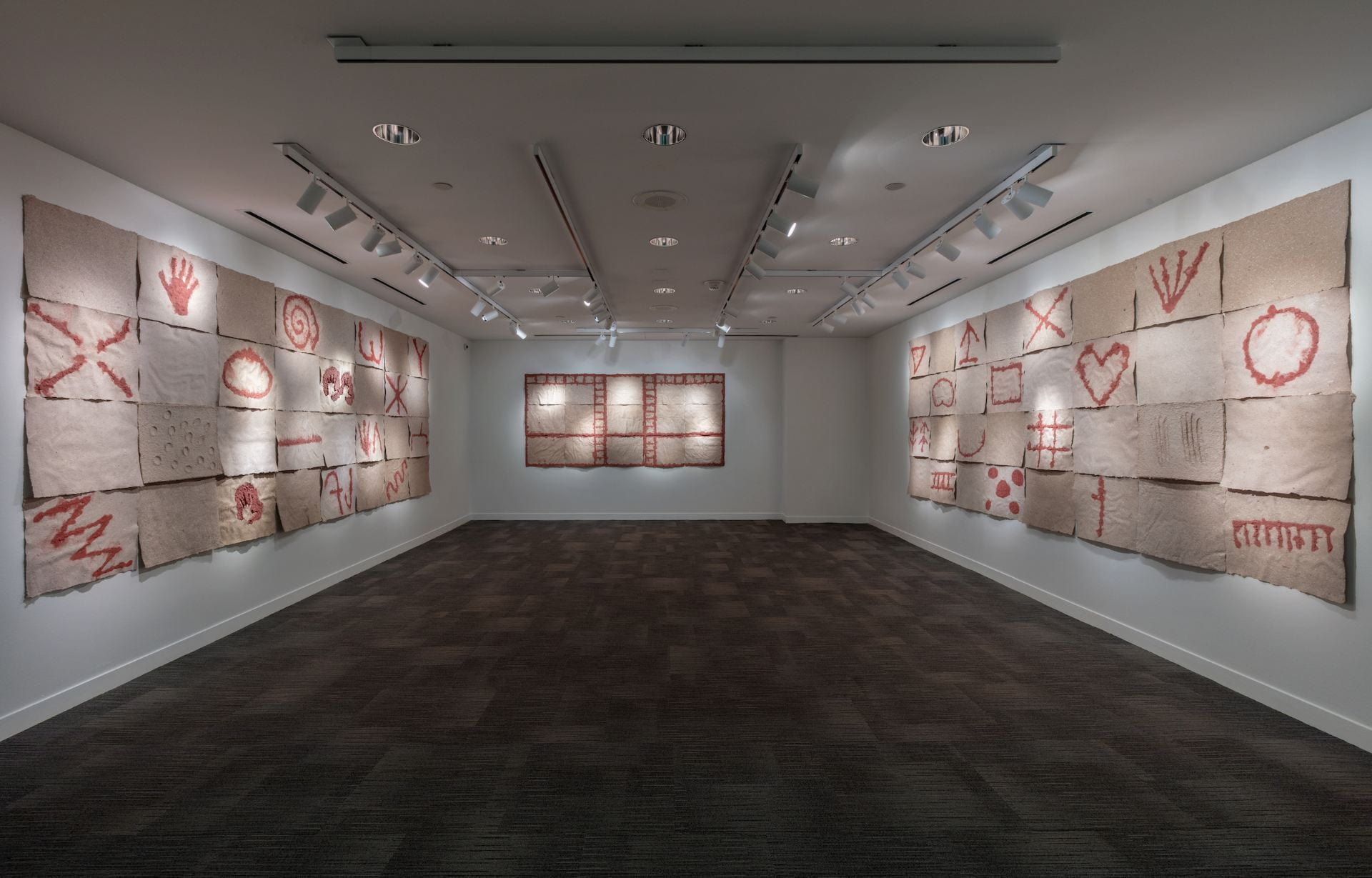
Phosphenes opened on March 3 in the Hawn Gallery, Hamon Arts Library. The symbols you use in these three large works, composed of paper sheets, derive from Genevieve von Petzinger’s catalog of what you deem is a universally “written proto-language.” She terms them phosphenes, which also refers to the visual phenomenon of seeing light splotches often in darkness and under certain conditions, such as migraines, rubbing one’s eyes, or taking hallucinogens. How do you see these two meanings fuse in these works?
I see the von Petzinger lexicon as a proto language, as well as one of the origins of form in art. Not only are many of these symbols exactly like many letters and symbols we use for written language today, they have also been utilized for making art since for all that time, and probably longer. When I found out about von Petzinger’s work, I had read a short paper by J. D. Lewis-Williams and T. A. Dowson, which theorized the origins of phosphenes. Based on anthropological work and experiments with various drugs as well as work with migraine sufferers, the paper posited that phosphenes, these basic symbols, were caused by various physiological pressures. Experiencing the stressful conditions of life thousands of years ago, people were seeing all kinds of things. They were inventing rituals and belief systems, dancing, painting themselves, adorning their living spaces and objects, and generally living in a way that is very difficult to imagine today. The big mystery, to me, is why people would be driven to make these marks in the first place. I suppose one thing leads to the other–life makes art. The torment of potent visions, perhaps, drove them to render and refine fleeting images, catching and pinning them to the walls like exotic moths.

Each sheet of paper of the same size has its own variation in texture and tonalities. Does the materiality of these works conform to the subject you hope to elicit? Or is the outcome more subtle?
Yes, I chose the materials to evoke the rough brown unevenness of a cave wall. I used recycled cardboard and some white paper to make the sheets and preferred it to be less refined. The large fresh sheets are awkward to handle as I peel them off the felts and place them on a drying screen, and sometimes creases form. The paper naturally dries, especially after the red pulp is applied, with waves and undulations, which further evoke the surface conditions found in caves or on rock outcroppings in the open. These artists rarely encountered a flat surface, and never a perfect one. Moreover, I like it when paper is allowed to behave like it wants to. The material almost seems alive.
You installed the lighting in a particular style that doesn’t give each large work an overall wash. Rather, the viewer sees a series of dim and bright spots on each one. Does that decision accord with an environment in which one questions what one sees?
That’s such a great way of putting it: “an environment in which one questions what one sees.” Yes, even though we could have gotten an overall wash on the works, as I was lighting them, I was pleased with the uneven lighting and decided to forego using the overhead lamps, which increased the contrast in the space. It gives one a sense of being in a space with less than desirable lighting conditions, difficult to navigate topology, all while using fickle handheld lighting. Perhaps it will remind some viewers that these symbols were painted in firelight. Many viewers at the opening commented on the lighting and said it evoked the experience of being in a cave. However, I don’t really want it to be theatrical, and don’t think that it is, but I do want viewers to get a sense that they are in an environment of uncertainties, that not everything is going to be accessible to them, and the subject matter isn’t something that we can, metaphorically speaking, shine a light on to completely reveal everything about its origins.
I’m also thinking how this exhibition departs in many ways from your exhibition, After 10, at ex ovo in 2020. Can you talk about the differences and similarities between these two exhibitions, and possibly others?
Yes, After 10–a 1:4 handmade paper scale model of the 1966 exhibition 10, was basically a reckoning with the formal properties of my work at the time. It stemmed from an astute observation from Michael Corris, one of my professors at SMU. 10, at the Dwan Gallery, was a tight exhibition of ten artists, one work each, that happened to herald a new style in American art: Minimalism. My paper works at the time were slabs and rectangular sheets, and because of this I was challenged to remake some iconic works of Minimal Art. It led me down a rabbit hole! After 10 required a variety of fabrication techniques, pulp mixtures and formulas, and deep research into the original show, each artist, and their work. Using a specific source for a body of work was a new approach for me, and led me to the next project I would do, called red-rag and pink-flag, in which all of the works were based on words and phrases in a short poem of the same title by E.E. Cummings. The strategy of using a specific source material for an exhibition is exciting to me. It provides a scaffold for the work to be built upon, and provides the viewers with further information to explore. When it came time to think about the exhibition opportunity at the Hawn Gallery, I thought a lot about mounting a show in an arts library. I remember that you originally proposed showing red-rag and pink-flag, but I wanted to make something new. A show based on a poem would have made a lot of sense, but what else could be done? This past Fall, I taught an Art Appreciation class at Dallas College, and my favorite lecture was on prehistoric art where I showed the class Genevieve von Petzinger’s research on phosphenes and cave painting. That’s when I got the idea to use the lexicon as a basis for the Hawn Gallery show, and it developed from there. I thought that an exhibition which presented the beginnings of language, symbols, and art forms was a good fit for an art library.
After 10 and Phospenes are both faithful recreations of specific forms, but Phosphenes takes a lot of liberties with presentation, format, and materials. I want viewers to be informed by von Petzinger’s research, but also dazzled by what I am bringing to it–the seductive texture of paper, the deep red of the iron oxide pulp, and the scale and rawness of the symbols.
Tell us about your next project or exhibition. And thank you for taking time for this interview!
I have an exciting new project with Michael Corris that will be presented at Liliana Bloch Gallery in Dallas. We are presenting a physical representation of a thought experiment that is described in Arthur Danto’s The Transfiguration of the Commonplace. I used my leftover red iron pulp from Phosphenes to make all the work for this show. It runs from May 27th-June 27th.
Tino Ward: Phosphenes continues to May 12, 2023.
More information: hours, campus map, and parking.
Email: hawngallery@smu.edu | Phone: 214-768-3813.