No More Clunky Documents

Whether you are working on a thesis or a project report, any lengthy document can be cumbersome to work with.  Two new enhancements to Word 2013 that I really find useful are the ability to expand and collapse headings and to set collapse by default.

New Features in Word 2013When you hover over a heading within your document you’ll see the triangular Expand/Collapse button. You can open or close that heading just by clicking on the button.

Expand_Collapse W2013

To expand or collapse all the headings in your document, right click a heading and choose an option from the Expand/Collapse menu.


If you want, you also have the ability to set the default to open in a collapsed mode. Once you have your cursor placed in a heading, navigate to the Home tab. In the Paragraph section select the Paragraph Settings button (#1).  Then, select the Collapsed by default option (#2) and click OKparagraph dialog box
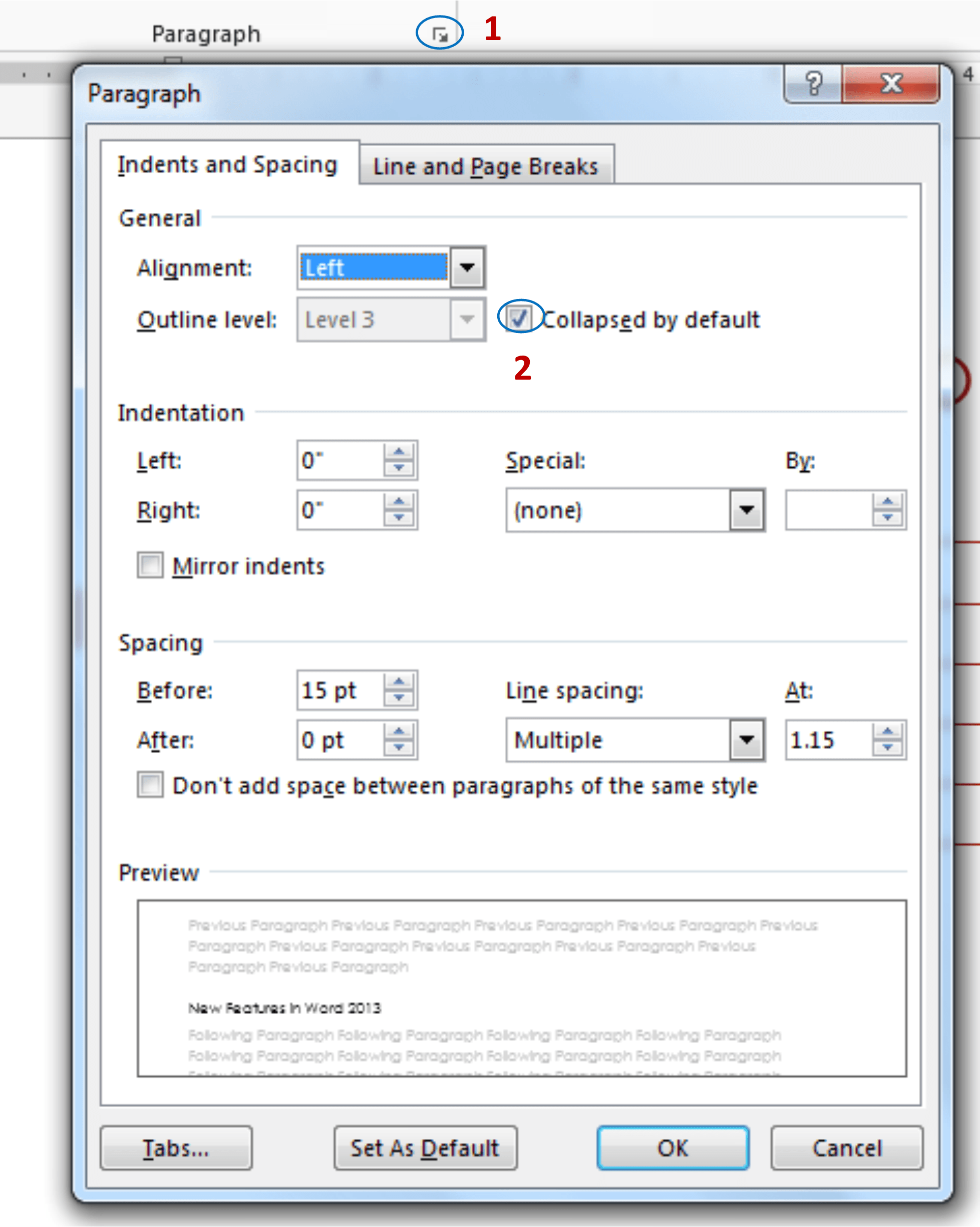
Viola! You should now have a document that is much easier to work with and looks something like the example below.

CollapsedIf you would like a tour of Office 2013 and learn a few shortcuts like these, come join my webinar on Sept 26 or Oct 30.


Digital Note Taking: Tips and Tricks for Keeping Track

by Zach Peterson

The whirlwind hustle and bustle of the new semester is behind us, and everyone is starting to settle in and focus on their studies. Whether you take notes on paper or digitally, your notebooks can get awfully cluttered and confusing as the semester rolls on. Once finals come around, you’re lost in a sea of information.

Taking notes shouldn’t have to be a pain! Since it is one of the most critical parts of a successful college career, it’s important to find a system that you’re comfortable with and one that is helpful when review time comes.

The Cornell Systemcornell system

If you’re a fan of the tried-and-true pen and paper, the Cornell System can make your note taking much easier and useful. It was first created by Cornell education professor Walter Pauk. It’s a simple method of splitting a single page into three sections; one for general notes, a small sidebar for keywords, and a small bottom strip to summarize the notes on that page. For more info and a template to take it for a spin, Lifehacker has you covered.

Evernoteevernote

One of the most popular web-based note taking applications out there is Evernote. It has applications available for PC, Mac, Linux, and most mobile devices. They can all sync to your account, so you’ll never be far away from your notes. You can also add multimedia and share your notes quickly with others. There are both free and paid versions of Evernote, with the paid version providing more features and storage space.

OneNoteonenote

If keeping your notes in the online cloud isn’t your bag, Microsoft has a great solution for Windows users that you may already have on your computer! It’s called OneNote, and it is included with most versions of Microsoft Office. OneNote is a powerful system that allows you to create multiple notebooks for different classes, projects, or anything else you may need. It’s super easy to edit text and insert multimedia like images, videos, and audio. OneNote also is capable of sharing notes with others. For Mac users, a good alternative to OneNote is called Outline.

Livescribe Penslivescribe-echo_0

If you like a mix of both the old-fashioned and the high-tech, an option for you could be a smartpen. Using specially-designed paper notebooks and an infrared camera, smartpens are able to save a digital copy of your handwriting for storage and searching. In addition to saving your writing, the pen can also save audio recordings and sync them with your handwriting, allowing you to tap on any portion of the page and replay audio. Just be sure your professor is okay with it before recording! These pens start at around $100 and can also work in conjunction with Evernote.

No matter what method you choose to take those notes this semester, it’s just important that you do!

From Blah to Beautiful

Successful Visual GuideAll of us have messages that we want to share with others, and let’s face it. Most of us don’t want to stare at pages of plain text all day.

How do we go from busy, text filled pages to something that your average Joe might want to read? Great question!

First, I remember back to mom’s art lessons. (It’s amazing what you can learn as the child of an artist!) She asked, “When you look at the page, what do you see first?” The goal is to grab the reader’s eyes at the beginning and pull them through your page. Often that means top left zig-zagging to the bottom right, but that’s not always the case. To the right the orange numbered arrows direct the reader through the document in a creative way.

You’ve got your reader’s attention. Now, how do you keep it? One method is using visuals or info-graphics… without sacrificing readability.

HARRY-POTTER-Infographic2-02

Info-graphics are intuitive, memorable, and often leave your page with desirable white space (the artsy term for the part of your page not covered with stuff). The example above is easy to read and engaging. To the left, you’ll see a graphic on Harry Potter book sales. While it’s visually super cool, you probably aren’t going to take the time to read all the way through that busy page (unless you’re a huge fan).

Appropriate formats vary by setting and audience. While not all of us are info-graphic design rock stars, would your readers rather read the plain text below or the vibrant info-graphic? Which stirs more creativity in the would-be social writer? And, what creative ways can you make your content pop?InfoGraphic vs. Plain Text

The Main Steps for a Successful Ebook info-graphic was from http://blog.widbook.com/infographic-steps-for-a-successful-ebook/.
5 Steps to Make Your Social Content Great was from http://www.graphs.net/201210/5-steps-to-create-great-social-content.html/5-steps-to-create-great-social-content.


Simple Markup: Easy on the Eyes

Recently I’ve been exploring some of the new features in Office 2013. While there doesn’t seem to be a whole lot of major upgrades to the Office Suite, there are a few changes that I really do like. One thing in particular is the Simple Markup enhancement to the Track Changes feature in Word.

If you’ve previously used Track Changes, you know that just opening your document can cause stress, let alone try to collaborate easily in it.

Here’s a snapshot of a document I recently worked on in Word 2010.  And, boy is that red text seriously making my blood pressure rise!Markup Capture

Take a look at the same document in 2013. I can actually read it easily when I first open it. If I want to dig in deeper and look at what was changed, I can. The document still opens with Track Changes on but by default will display in the Simple Markup view. Changes that were previously made are indicated by the red bars on the left. If you click on a bar, you’ll still see the markup. This new format definitely makes it much easier on the eye.2013 track changes

This is just one of a variety of new features I’ve been toying with.  If you’d be interested in taking a tour of what’s new in Office 2013, consider joining me in one of my upcoming webinars, and I’ll show you a whole lot more!